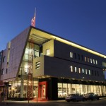
In this project, at the beginning of the plan despite the land being small, restricting regulations of the urban development, the geometry of the land (the great beveled of the edge) and the small area of the infrastructure, we tried to have a deeper and more different approach to the plan, because we encountered a familiar name of the country’s automobile industry (Saipa), so that in addition to responding to the needs of the employer, we could also step into a higher realm of architecture. Additionally, this project was on the corner of a communication joint of an active commercial row and a residential texture around it, so that we tried to design an appropriate model for this case.
We considered two axes from the project topic and automobile industry that one was technology in the industry and the other one was speed and movement, and we tried that our architecture also includes a manifestation of these two concepts and tried to be faithful to the end of the details, including the entrance stairway and …… to the axial ideas and concept of the plan.
Sheer volumes and sheets sliding on each other, dynamic and energetic, glass surfaces, glass transparent structure (facades), the relatively large console, white and black color combined with stimulating have been part of our manifestations and means in reaching this plan.
Placing a project with industrial-commercial manifestation, neighboring a residential context was one of the big challenges of the plan, which we tried to respond to it.
1-By studying the mass and space system as well as the operating system of recreational and residential spaces in the site of the project, we concluded that the site should be defined in three levels and lay out based on the triple definitions: privacy of performance systems, access, mass and space. General definition, semi-private, full private with linear organization were planned, considering the geometry and stretch of the site.
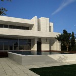
2-According to the study of the psychological sense of the colors in recreational and residential applications we have reached this conclusion that due to the accompanied nature of the project with the nature and the convey of the refinement sense, we should move towards pure colors, so we found the response in white color.
3-the nature of weekend recreational spaces requires creating quiet spaces, therefore, the summer porch overlooking the water with a maximum depth of visibility was designed. Semi-transparent spaces (porch) with the cooling and climate influence were also considered in the process of designing. Layered plates placed in the plan perform its own play of light and special shade in the morning and at midday and grants its own flavor and atmosphere to the porch of the project. Considering the location of the site in the plain, the presence of existing green layers in the roof plates, it brings the climate moderation.
4-during the stages of designing and creating the form, it was also attempted to observe the concepts of composition in accordance with the principles. Designing the broken skyline with the withdrawal of the horizontal axis and its combination with the entrance element which is raised as the most significant part was designed as vertical element.

