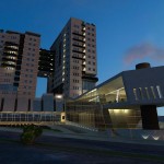
Idea:
In fact, this project is in the overview plans of this office, because it was referred to us at the point of implementing the columns and cores of the shear walls on two floors and through maintaining the mass laying limitations and plan, the main structure of the plan was changed and revised. Certainly without maintaining these restrictions, the possibility of more maneuvers would have been provided for the designer.
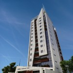
This building has two underground floors with the parking, pool and storerooms application. Its pool was also added to the work during the overview. The ground floor has a lobby, auditorium, gym and children’s play area, coffee shop and play area. Five floors have two units and eight floors are single-unit and a duplex penthouse, are all units of this project.
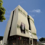
The facade of the project consists of a plate which seems as if, as a result of lightning it has been cut with a special form. This plate with a variable opening in some parts of the main terrace of the units, which are located in the middle of volumes has created privacy and provides comfort for the residents.
The front space of the building at the edge of the street, relatively open connection to the adjacent lane and sidewalk has created an intimate bond with its surrounding environment.
In this project, at the beginning of the plan despite the land being small, restricting regulations of the urban development, the geometry of the land (the great beveled of the edge) and the small area of the infrastructure, we tried to have a deeper and more different approach to the plan, because we encountered a familiar name of the country’s automobile industry (Saipa), so that in addition to responding to the needs of the employer, we could also step into a higher realm of architecture. Additionally, this project was on the corner of a communication joint of an active commercial row and a residential texture around it, so that we tried to design an appropriate model for this case.
We considered two axes from the project topic and automobile industry that one was technology in the industry and the other one was speed and movement, and we tried that our architecture also includes a manifestation of these two concepts and tried to be faithful to the end of the details, including the entrance stairway and …… to the axial ideas and concept of the plan.
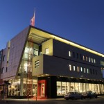
Sheer volumes and sheets sliding on each other, dynamic and energetic, glass surfaces, glass transparent structure (facades), the relatively large console, white and black color combined with stimulating have been part of our manifestations and means in reaching this plan.
Placing a project with industrial-commercial manifestation, neighboring a residential context was one of the big challenges of the plan, which we tried to respond to it.
1-By studying the mass and space system as well as the operating system of recreational and residential spaces in the site of the project, we concluded that the site should be defined in three levels and lay out based on the triple definitions: privacy of performance systems, access, mass and space. General definition, semi-private, full private with linear organization were planned, considering the geometry and stretch of the site.
2-According to the study of the psychological sense of the colors in recreational and residential applications we have reached this conclusion that due to the accompanied nature of the project with the nature and the convey of the refinement sense, we should move towards pure colors, so we found the response in white color.
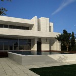
3-the nature of weekend recreational spaces requires creating quiet spaces, therefore, the summer porch overlooking the water with a maximum depth of visibility was designed. Semi-transparent spaces (porch) with the cooling and climate influence were also considered in the process of designing. Layered plates placed in the plan perform its own play of light and special shade in the morning and at midday and grants its own flavor and atmosphere to the porch of the project. Considering the location of the site in the plain, the presence of existing green layers in the roof plates, it brings the climate moderation.
4-during the stages of designing and creating the form, it was also attempted to observe the concepts of composition in accordance with the principles. Designing the broken skyline with the withdrawal of the horizontal axis and its combination with the entrance element which is raised as the most significant part was designed as vertical element.
This project with commercial application and multilevel parking lots has been designed to solve the problem of urban congestion (city traffic) in the operating boulevard and also organize the guilds of curtain and fabrics and interior decoration of the building.
First, the employer’s requirement was to design two projects namely “Harir and Abrisham” at two sites against each other and in interaction with each other. At this phase of designing, the ground and first floors occupancy area has been a hundred percent and the parking levels have been seventy percent.
Two projects of “Harir and Abrisham” were designed in ten floors, one floor warehouse, three floors commercial and six floors parking lots and the connection between two projects on both sides of 35-meter operating boulevard through the overpass was proposed to the employer and was accepted.
In the second phase, designing of “Abrisham” project was removed and the occupancy area of the parking levels in “Harir” project despite the consultant’s objection was added a hundred percent and other applications such as Hall and administrative applications on the top floor were added to the complex and the project building was revised again in 15 floors consisting of four commercial floors, a warehouse floor, a 9-storey parking and one Hall and administrative floor and due to these changes the consultant’s view has been to redesign the façade. Providing maximum useful commercial and parking space, and avoiding mixing different applications in this complex and individuals’ easy access to the places desired have been among the objectives of the plan design.
The employer’s applications required are as follows:
Providing 150 residential units
Providing the parking required on -2, -3 and -4floors, providing a number of commercial units on the ground floor, -1 and +1 floors and providing sport and recreational spaces
This competition was held with limited recall with the topic of designing Khorasan Dentists’ residential complex, in summer 2010.
In the first phase among 15 people invited, 3 individuals were selected and the competition was held.
Locating and mass lay out form of this project has been conducted, considering the requirements and tastes of the target group (addressed group) of this project and the climatic conditions of the target site including: lightning, the winds blowing direction, the visibility and special view of the site, the city view and the southern part mountain, in order to provide maximum rate of comfort for the individuals.
After studying the above-mentioned points, the residential towers were designed in the form of 3 blocks, which the northern blocks have 13 floors and the southern block has 6 floors.
In this locating, the unfavorable entry of north western wind to the enclosure has been prevented by a mass. On 4 floors through connecting bridges between two northern blocks and on the best view condition of the site, the semi-open neighboring court yards for intimate relationship of the members, who have similar cultural context, have been formed and they are the main volume features of this project.
